Making the arts more accessible in Boston
brief
Our goal was to use different design research methods to produce a project that would respond to the needs of our research. My partner and I wanted to focus on the arts scene in Boston (or lack thereof) and how we could make it more accessible. By accessible, I mean to provide more visibility to events and make sure people have all of the information they need to make an informed decision.
context
Research Methods at Northeastern University — Fall 2025
tools and methods
- Ethnographic Surveys
- Stakeholder Mapping
- User Interviews
- Affinity Diagramming
- Secondary Research
team
Zach Marino, Lane Afrookteh
timeline
12 weeks
insights
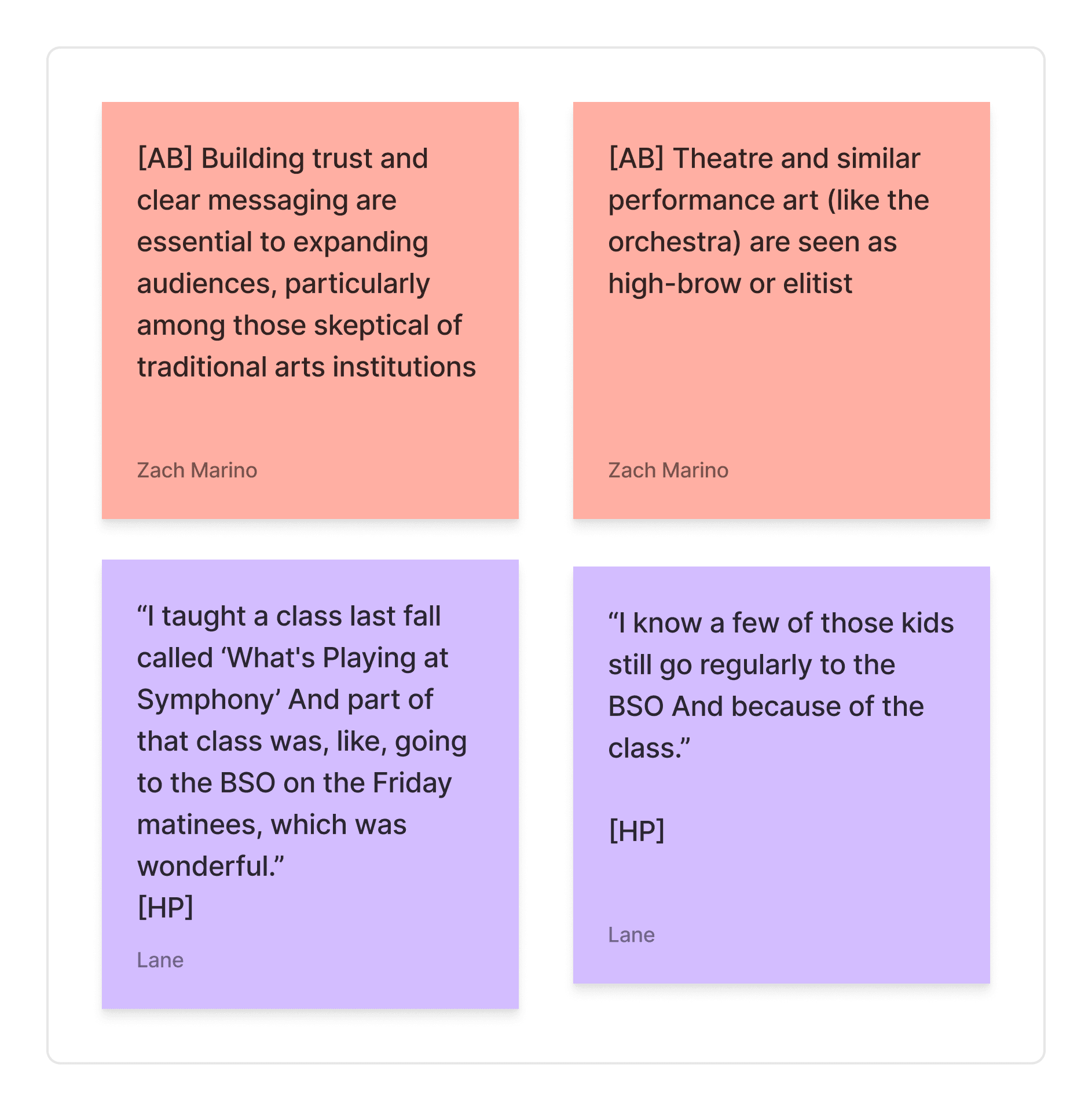
We noticed a barrier of perception around the arts during our research. People viewed the arts as “elitist” or were otherwise skeptical. We also found that our interviewees were much more likely to get involved with the arts after being exposed for the first time. We also found that it was important to provide users with a "rules of engagement" for events to promote getting involved, though secondary research was needed for the amount of information.
deliverables
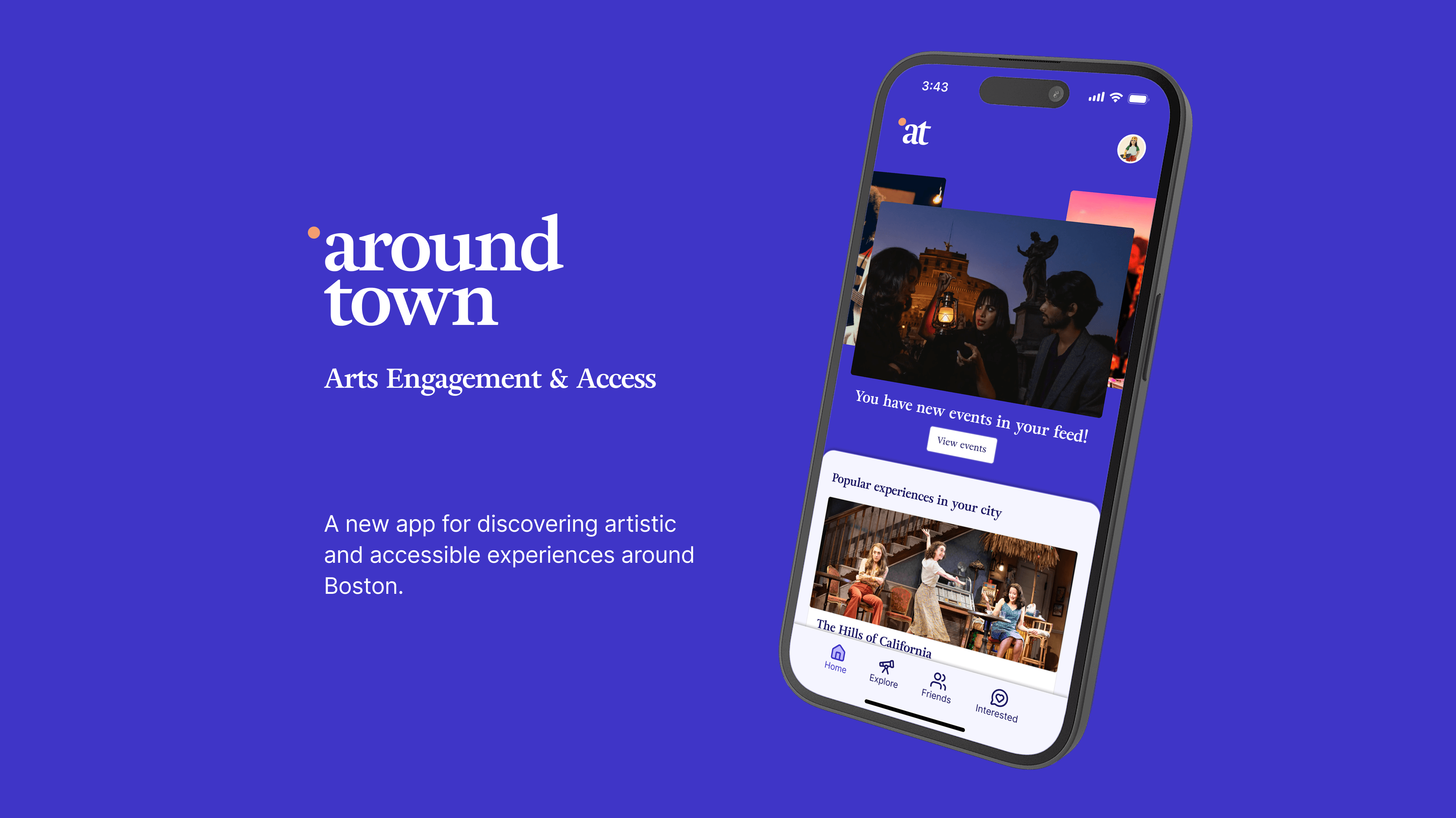
We used our research to create an interactive mobile prototype that focuses on event discovery and accessibility. All users get a feed based on a recommender system that provides events in the area based on their interests and content tags. They can also send events to their friends and see what they are interested in to set up group experiences. The logo and brand colors were inspired by the painting L'Heure Bleue by Carl Soete.
the challenge
When deciding on topics to pursue for this project, something my partner and I both cared about was the arts. But despite the amount of young people in Boston and a surprising amount of artists, the arts lack the attention they get in other cities like New York.
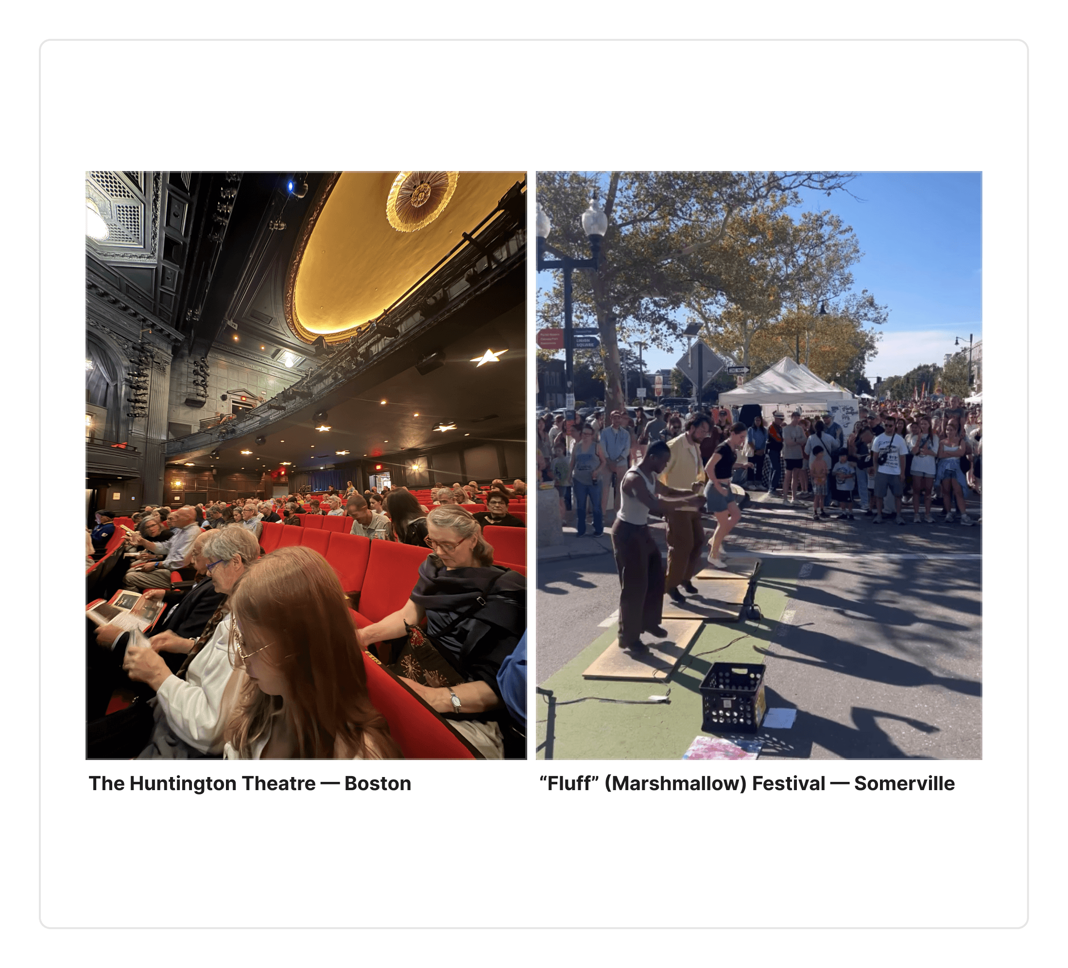
After conducting an ethnographic survey at a local theater and festival, we noted the differences between them and found a gap in the types of experience people engaged in.
Free, community-oriented events like the Fluff festival had a lot of visibility and took up public space, which encouraged participation from all walks of life. Expensive, closed events like the theater primarily catered to old white people who could afford an expensive ticket, despite there being discounts for other groups (e.g., students, pay-what-you-want).
the research
We created a stakeholder map to define our problem ecosystem and identify people we could interview. We interviewed 8, who were either attendees, institutional stakeholders, or subject matter experts. We distilled all of the insights into two affinity diagrams and gleaned 4 takeaways (full diagrams can be viewed in the full report at the bottom of the page) →
With these takeaways in hand, we drafted a "how might we" statement to guide our prototyping:
How might we create an entry point/opportunity for people to engage with and feel comfortable/empowered by the arts?
the prototyping
We created four prototype iterations. The first was a provotype used to provoke a response to the different characteristics of an artistic experience (travel, price, interests, content warnings, etc.) when deciding whether to attend. Users appreciated the authenticity and usefulness of the “what to expect” section, but needed some kind of draw besides just showing events to people.
Our second and third prototypes fleshed out the interface and features, adding user settings and a social experience that would let friends send events to each other and coordinate.

the branding
Our brand colors were inspired by L'Heure Bleue by Carl Soete. The indigo color felt fresh and intentional, like the pigment Yves Klein invented for his blue paintings, tying back to our values of artistry.
We chose the typeface Adriane Text because we wanted a sans-serif display type that also felt intentional. A great example of this intentionality is the letter "r", whose arm has a unique shape.
The smaller logo on the right can be incorporated into the interface as a replacement for the @ symbol, which reinforces our brand in the interface.

full prototype
Loading Iframe content...
final report
Loading Iframe content...